Professional tools for everyday sellers

Starting with online auctions, eBay has evolved into a worldwide marketplace for peer-to-peer and retail sales.

With competitors closing in, eBay wanted to better understand their customers and imagine what their seller experience would look like if they designed it from scratch. Our research identified several unique thinking styles and an opportunity to address the needs of their most important sellers — those growing a small business.


Driven by deep customer insights, we designed a unified, scalable toolset for the modern seller with a fully refreshed look and feel for their product teams to use as a model of their future experience.

Role

UX Designer

Project Length

4 months

Research & strategy

We knew that the client team needed a better understanding of their users, so our research team interviewed sellers of all types to identify pain points and opportunities while developing a framework to simplify the way we think about their needs.

Shoe boxes piled up in a seller's home
Storage racks full of products in a seller's garage

“Responding to customers quickly is my number one priority. If I don’t respond, 
they’ll go somewhere else.”

Foundational research participant

“Responding to customers quickly is my number one priority. If I don’t respond, 
they’ll go somewhere else.”

Foundational research participant

“Responding to customers quickly is my number one priority. If I don’t respond, 
they’ll go somewhere else.”

Foundational research participant

Mosaic of a research deck

Setting a vision

Our clients wanted something that felt totally different, and the first phase of the project set out to re-imagine the seller experience, focusing on growing sellers into successful businesses. The new look and feel leveraged a bold, high contrast system to direct the user and add clarity to the dense components of the platform.

Mosaic of visual design explorations
Close-up of an insight card
Mockup of the listings page on a laptop

“I love all of the information that’s available…It helps you be more marketable and 
know how to stand out.”

Concept testing participant

“I love all of the information that’s available…It helps you be more marketable and 
know how to stand out.”

Concept testing participant

“I love all of the information that’s available…It helps you be more marketable and 
know how to stand out.”

Concept testing participant

Refining a product

With the client team bought in to the new vision, I took over the project to bring it home, fleshing out the experience using real world scenarios and edge cases on both desktop and mobile.

The design tends to change a lot during this phase, but sticking to our established principles and patterns ensures that we don’t lose the key aspects of the vision that got everyone excited in the first place.

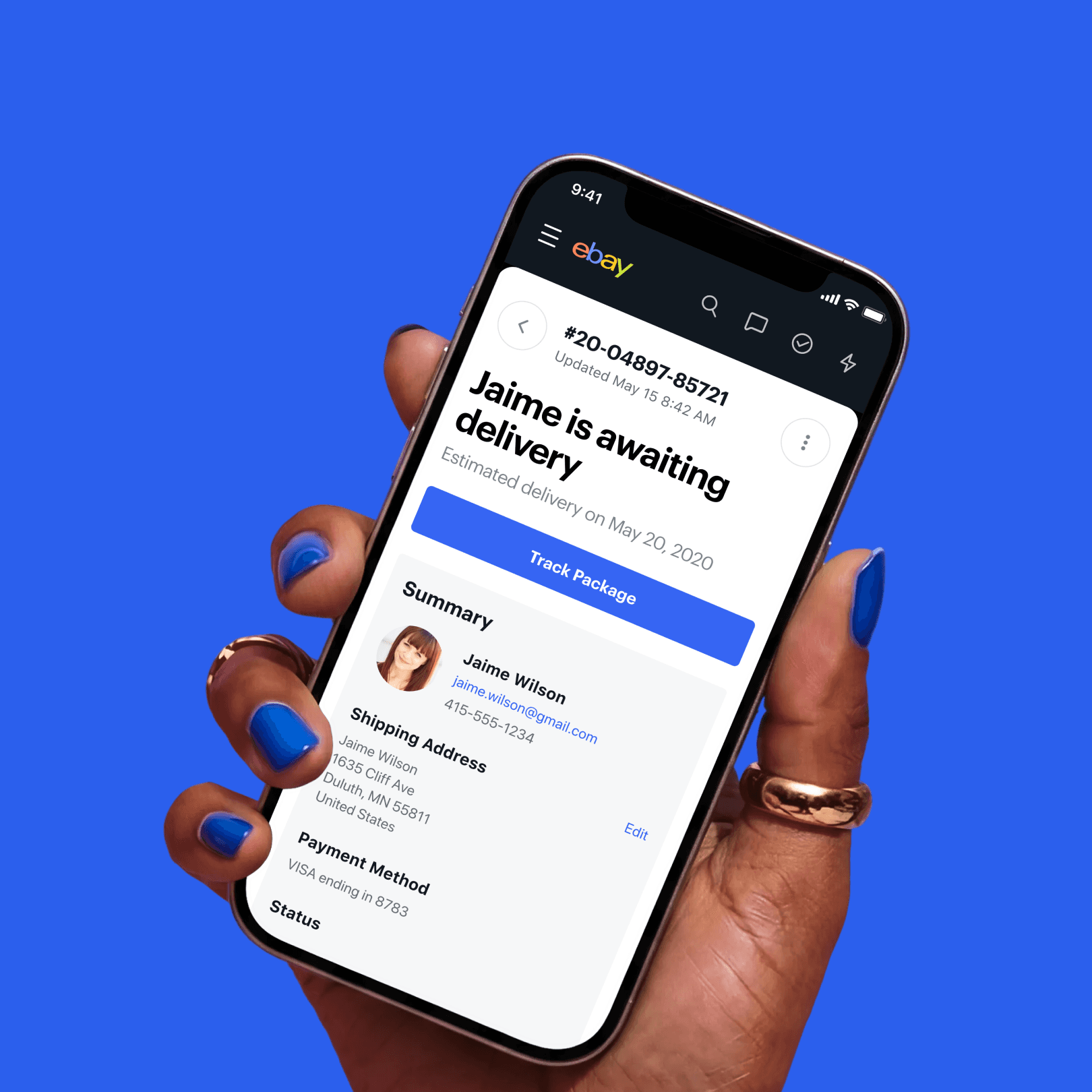
Multiple mobile screens
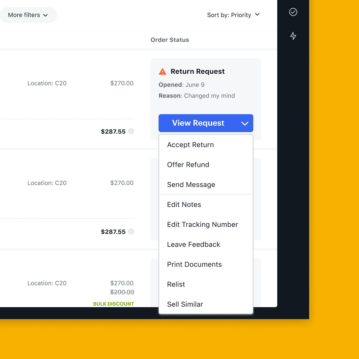
The orders and order details pages
Close-up of the mobile navigation
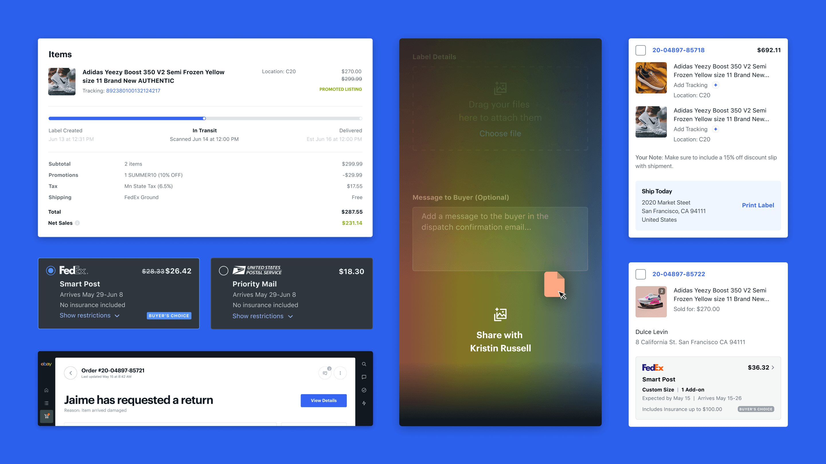
Isometric layout of detail panels
Mosaic of final documentation deck

There’s much more to share, so let’s connect.

There’s much more to share, so let’s connect.

There’s much more to share, so let’s connect.